Virtual Reality Design: Immersion is Fragile
You wade through a dense, perilous jungle. In an endless search for remnant supplies you scan the ground. Hot scrap metal hisses among the wreckage of the spacecraft that crash-landed. You gulp as you take in the new surroundings on what seems to be an island on a foreign planet. You are the only survivor, that you know of. A rustling sound over your shoulder causes you to almost snap your neck as primal instincts kick in. Your eyes frantically dart across the foliage, hoping for the intruder to reveal itself. Your heart races and the hair on the back of your neck stand on end. A creature emerges from the foliage with a twisted scowl and low growl. It slowly approaches as you reach for your gun. You bring the gun up, and pull the trigger. It doesn’t fire but drops out of your hand to the ground, wrong button.
As you bend down to pick it up, your hand goes completely through it. The frustration builds. You finally pick it up and try to fire one last time, but again click the wrong button. The magazine falls out of your gun to the ground. The fragile state of immersion has been broken. You remember you are simply in a simulation courtesy of the latest VR hardware and software. The game isn’t over but your suspended disbelief is. When user experiences and user interfaces in virtual reality aren’t crafted with the important nuances of the technology in mind, users will find themselves struggling to be immersed in the world you are trying to create. Even worse, they might get sick.
User Experience is King
According to the 2016 Augmented and Virtual Reality Survey Report by Perkins Coie, “user experience is one of the biggest obstacles to the mass adoption of VR technology.” The report also mentions, “more obstinate problems included lack of development of human interface components (e.g., making the experience more ‘virtual’ and less ‘reality’).”
“user experience is one of the biggest obstacles to the mass adoption of VR technology”
But how do we bridge that gap and make virtual reality feel more real? How can we make it enjoyable and improve the overall user experience? I’m going to give you 5 virtual reality design considerations to keep in mind as you create the next killer app for virtual reality.
Avoiding VR Motion Sickness
One of the biggest challenges in virtual reality design for the last 40+ years (yes it has been around that long) is avoiding the onset of motion sickness in VR. It is one of the issues most likely to cause adverse experiences in VR. I’m going to focus a lot on this topic. I’ll also explain some important considerations that will hopefully give you valuable insight into how you can proceed creating your next VR experience.
Lets start with the definition for motion sickness, “motion sickness refers to adverse symptoms and readily available observable signs that are associated with exposure to real and/or apparent motion.” (Excerpt from: Lawson, B. D. (2014). Motion sickness symptomatology and origins. In Handbook of Virtual Environment: Design, implementation, and applications, 2nd ed. (pp. 532-587). Boca Raton, FL: CRC Press.). Explained simply, if your eyes tell you that you’re moving and your body doesn’t buy it, you are likely to feel sick. Various mismatches happening between what is seen by your eyes and what is felt in the body cause this. And we all know, being sick = not fun.
“Motion sickness refers to adverse symptoms and readily available observable signs that are associated with exposure to real and/or apparent motion.”
Groups of Contributing Factors
There are 3 different groups of contributing factors that can cause this sickness: individual user factors, system factors and application design factors. For this virtual reality design article we will ignore the user factors and system factors and focus on the design factors. Here we are assuming that we can’t control the genetic sensitivities some have to motion sickness (user factors) and that users are utilizing high end machines and head mounted displays that are low latency, have high tracking accuracy, and a high refresh rate. With these out of the way we can focus on the design decisions you can make to reduce motion sickness.
Motion Sickness Reducing Design Tips
To reduce motion sickness in your experiences, keep these virtual reality design considerations in mind:
- Give users control of their navigation. Avoid transporting the user around without direct input from the user. If the environment changes in an unexpected way without the user controlling it, the entire world will appear to move in a strange way and cause mismatches between the user’s balance / movement systems and what they are seeing in the virtual reality headset. One example of this in the real world, “At a higher level, drivers and pilots who control their vehicle motion rarely exhibit motion sickness although the same individuals sometimes report motion sickness when they are passengers” (“Rolnick, A., and Lubow, R. E. (1991). Why Is the Driver Rarely Motion Sick? The Role of Controllability in Motion Sickness. Ergonomics, 34, 867–879.”)
- Reduce fidelity and physical head motion in your game if hardware cannot support it. If your design is high fidelity, it can take more computational processing power and can thus affect the frame rates in the virtual reality headset, varying framerates can cause motion sickness. Insufficient computational power can also increase latency. Try to limit the amount of physical head motion required by your user if you are designing for mobile VR. Mobile devices obviously have a much less processing power when compared to desktop virtual reality experiences. However, this might reduce the quality of the experience. One suggestion might be to reduce the fidelity (amount of polygons) in the environment to allow more physical head motion in your experience.
- Use rest frames. An example of using a rest frame in the real world is kind of like when you are sitting in the back seat of a car and looking out the front windshield. You can still see other parts of the car as you view out of the car and see the scenary whipping by. The inside of the car that you see, in this instance, is the rest frame. It is the part of a scene that the user deems as stationary relative to other motion. Another example of this in a game is being able to see the cockpit of a spacecraft you are sitting in as you navigate a galactic universe. Rest frames can help create visual cues that make an experience feel more stable and reduce motion sickness.
- Binocular-occlusion conflict. An example best describes this conflict. As many of us have experienced in typical 2D games, there are often heads up displays to help provide a view of item inventory, player stats and health, etc. These heads up displays should not be directly ported from their 2D experiences into a virtual reality environment. Considerations need to be made to avoid confusion and strain for players in the virtual 3D environment. If you are going to put a heads up display in the 3D environment, it is best practice to put the display at a distance that isn’t too close to the eye and also takes into consideration other 3D object in the environment. For example, if the display is set at a perceived distance of 3 feet from the user, if another character crosses the space between the viewer and the heads up display, the viewer should see the crossing avatar appear in front of (and obstructing) the heads up display. This way immersion is not broken and it will help avoid eye strain and user confusion. Stereoscopic cues that do not match occlusion clues can lead to eye strain, confusion and motion sickness.
There are many other theories of ways virtual reality design might cause motion sickness but utilizing some of the tips will put you leaps and bounds ahead of anyone trying to simply dive right into VR. Lastly, it’s very important to remember that porting a 2D game directly to 3D is almost NEVER going to create the ideal immersive experience. This can sound daunting but it’s our opportunity as designers to improve this new immersive medium by discovering new usability patterns and experience best practices to help the entire industry and world understand why VR is such a game changer.
“it’s very important to remember that porting a 2D game directly to 3D is almost NEVER going to create the ideal immersive experience.”
On-boarding Confusion
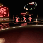
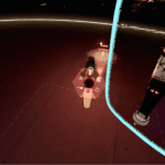
 If you’ve ever designed a game, mobile utility app or other software experience, you’ve probably had to onboard a user and get them up to speed with the rules and operations the experience is meant for. Many times the best course of action is to have the user “do” something instead of just presenting a bunch of text boxes for them to close out. This is the same for virtual experiences but the “do” portion of on-boarding can be much more immersive and fun. One of my favorite on-boarding experiences so far in virtual reality is the game called Space Pirate Trainer.
First off, the virtual reality design of the game is simple enough to be able to explain in 3 main steps “swap,” “evade,” and “mode.” Everything else in the game is fairly simple. When you enter the game, you are immediately able to see the 3 steps. If you want to be walked through the different steps, they also have a tutorial mode that gives you step-by-step guidance. The tutorial is a good mix of function-focused (explaining the 2-3 core functions of the experience and how to use them) and doing-focused that chunks the information up so you aren’t overwhelmed.
Chunking
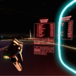
This is one of the key differences to notice across different virtual reality design experiences, the chunking. Using huge blocks of tutorial text is a pattern that you’ll find in some experiences and is a lazy approach to on-boarding. Stay away from this pattern if at all possible. Space Pirate Trainer uses chunking to remove friction and reduces cognitive load. Less friction can help the user to get in the game quickly and increase enjoyment. This experience is a must-try so you can really understand what I’m talking about. Contrast that with Hover Junkers and you’ll clearly see the difference.
I know that’s a lot to take in all at once so once you’ve had a chance to digest these initial concepts and do your own supplemental research join me for part 2!



Comments are closed.